I. Sketches & Wireframes, 1
December 20, 2024
As a team we sat down and started to individually sketch up rough wireframes for the app, how the app presented the map , different menu options and how and where the user would navigate through the different “pages”. Our motivation for this exercise was to spark a discussion on each individual vision on how the app should look, feel and behave. After each team member had presented their own idea of the app we started to discuss what the goal of the app was, which in short is showing the user where they can park and/or when they should move their car. During a discussion where we put ourselves in the shoes of our user stories, we realized that almost all of our sketches included a login page. For users who are already skeptical about digitalization, we found it appropriate not to force them to sign up in order to use the app (Nielsen's Heuristic, user control). Instead we went with the approach that the user could simply just download the app and start using it right away with the basic GPS navigation needed to find parking. The interested user would be able to sign up for an account to use functions like “save my spot” and “My cars”. With this in mind we discussed other of Nielsen’s heuristics that would be appropriate to implement to our project.
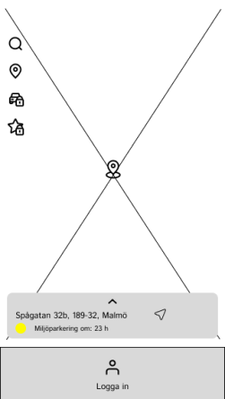
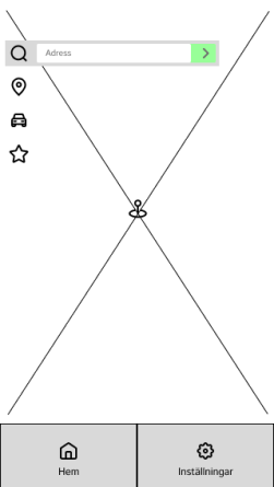
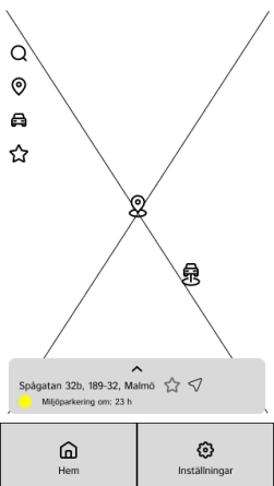
We also explored other relevant Nielsen heuristics to enhance our project's usability. For example, the user could search for a street, the app instantly provides parking notifications through an intuitive color-coded system:
- Red: Parking is currently restricted due to factors such as environmental regulations.
- Yellow: Parking restrictions will apply within the next 12 hours.
- Green: Parking is currently allowed with no restrictions.
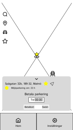
This visual system aligns with Nielsen's heuristic of recognition rather than recall, enabling users to quickly understand the parking status without needing to interpret complex instructions. Upon noticing these colors, new users are likely to interact with the information box, which then expands to display detailed explanations about the parking rules for that location. This step-by-step approach ensures clarity and allows users to plan their parking and routes more efficiently.
I. Sketches & Wireframes, 2
December 20, 2024
We came to a conclusion from our sketches that the navbars and different pages were unnecessary and that our approach should be a minimalistic design and efficient system, but also taking recognition into consideration. The reasoning behind this is that we found we had far too many different pages and navigating through the app would have been either frustrating for the user and/or confusing. There was no point in having different pages for everything when we could utilize icons on the map to perform actions.
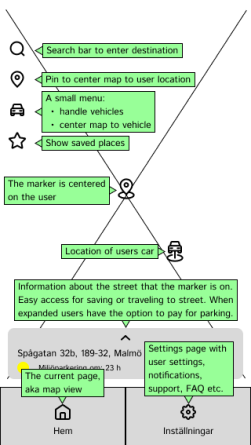
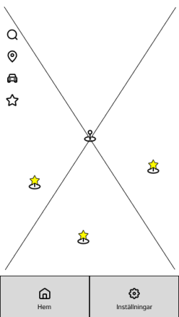
The result was a large map that utilized the user’s coordinates to display streets, allowing navigation with a pin that could be moved by scrolling the map. At the bottom, a “Login” button was available if the user was not signed in. Once signed in, this button was replaced with two options: “Home” and “Settings,” both featuring recognizable icons. We also sketched icons to be placed on the map for signed-in users, including:
- A magnifying glass for search.
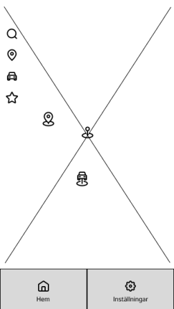
- A pin for using the user’s current location.
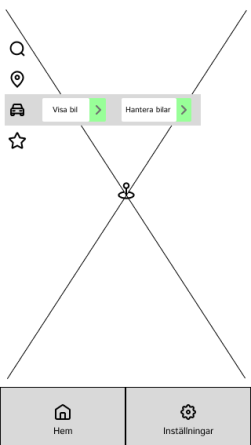
- A car for showing the last location where the user parked and for registering one or multiple cars.
- A star for saved places.
This design choice focused on simplicity and ease of use while maintaining an intuitive and recognizable interface.
II. Why & How We Came-up With Design Choices
December 20, 2024
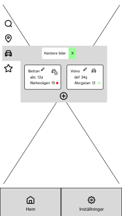
At its core, our interaction model is one which users can internalize quickly if they have not already done so from using other map based applications. The focal point is for the user to be presented with familiar icons, concepts and an intuitive interface with which our users can quickly become familiar with in accordance with the Nielsen heuristic idea of matching the system together with the real world. E.g. the car icon in the interface takes the user to the list of vehicles that the user has registered.
The glue that holds our application together and the way we ensure that our users always stay oriented is the fact that the visuals are clear and offer our users quick and total mastery of the application. This is in line with the Nielsen heuristic idea of consistency and adhering to standards since our users, most likely will have certain expectations from previous experiences with other applications. These previous experiences should provide a smooth transition with a very low learning curve into our application and a certain level of continuity is assured.
Corresponding with the Schneidermann heuristic idea of reducing short-term memory load for our users we have scaled down the amount of features for our application to a minimum of buttons and icons. There are four icons from which one (the car icon) will have a drop-down menu and two main buttons in the footer.
III. Selection of Interface Elements & Controls
December 20, 2024
In order to achieve a higher user experience for our product we had efficiency and effectiveness in mind. We aspire to have an application that requires very little effort when using the app. It should be easy to understand and navigate regardless if you are the most technical or not, because our user-group has a wide age-span. Upon discussion where we had both our personas in mind, we decided that when you just download the app you come straight to the map where you have a GPS function and a sign in button. The sign in button is optional to use, but is required if you wish to unlock functions like favorite streets and where your car is parked at the moment.
- Once the user has signed in, the front of the page will have two buttons instead: Home and settings. Which are symbols of a house and a gearwheel. These are simple but commonly used symbols for users to recognize and understand.
- Under the settings we decided to have information like terms of use, FAQ, about us and settings for notifications. This only appears when you have a created profile. Which is an intuitive place for users to find information if needed.
- We went from having four buttons originally, but felt that it's faster and more user friendly if the functions are in plain sight, intuitive and self-explanatory. The original idea for the buttons was that we would have a user profile, maps settings, parking and support in the navigation bar. To simplify the design we felt that as a user you don't want to look for and press at different buttons to see where different things are.
The symbols we chose to display on the map are simple and easy to understand.
- F.eg. a magnifying glass for the search field, a pin needle is to find your current location if you have looked into a different location and need to go back. This is what GPS normally has as a function and the user will recognize the logos and what they represent. We chose a car to symbolize the user's car. It felt simple to understand. The star symbolizes the user's favorite location. Where you can have multiple ones.
- When the user is logged in, one feature is that the information box will also have payment options for the user. So that you can pay for parking via your bank card or swish. When it's a new app the trust is not there by default, so this way the user can benefit from having the freedom to use the app on their own terms, without feeling like they are forced to add private or sensitive information. Once the trust is there for the app, the user can create a profile where the favorite streets and "where is my car parked" becomes available and you can also have the option of paying for your parking.

